Make Your Art Standout With Contrast

Unless you make your art stand out, people keep scrolling.

Your art watching people scroll by.
So how do we make our art grab attention?
Solution #1
Use high value contrast

“Since Contrast means “the difference between”, and Value (in color terms) is lightness or darkness, Value Contrast is the difference between the lightest and darkest parts of your [drawing].”

The greater the difference between dark values and light values, the greater the contrast.
Which eye drawing grabs your attention?

Why does the left eye drawing grab your attention more than the right?

The left eye drawing has a greater difference between the darks and lights.
The drawing on the right has low value contrast. You can barely see a difference in value. Since there’s too much similarity between the lights and darks, it becomes boring compared to the left.

How to achieve high contrast art
A) Put the darkest darks next to the brightest lights
“Value contrast is most evident when black is next to white.” - Julianna Kunstler

Illustration by Julianna Kunstler
B) Use the right tools
A common problem beginning artists have, is not owning the right tools. Get yourself the right tools to create high value contrast. A pencil set from 2H to 8B, white colored pencil, black colored pencil, and a gel pen should be in your arsenal of art supplies.
Look at the two eye drawings again. Although, I used the same paper, the same reference photo, and the same hand, I got very different results. Why? Because I used different tools.

For the high contrast eye drawing on the left, I used 3 tools:
black color pencil
white colored pencil
white gel pen
For the low contrast drawing on the right, I used ONLY a 2h pencil.

I was doomed from the start.
Your turn!

Reference photo
Draw the eye in the reference photo using ONLY a 2H pencil on toned paper.
Then draw the eye again on the same toned paper, but this time use a black and white colored pencil, and a white gel pen.
Why I recommend using toned paper
Beginning artists tend to get stuck in the middle range of value. A toned paper starts you off in the gray value range that beginners often get stuck in, and reminds you that you have to use darker values and lighter values to create high contrast. Toned paper will make your black colored pencil, white colored pencil and gel pen pop!
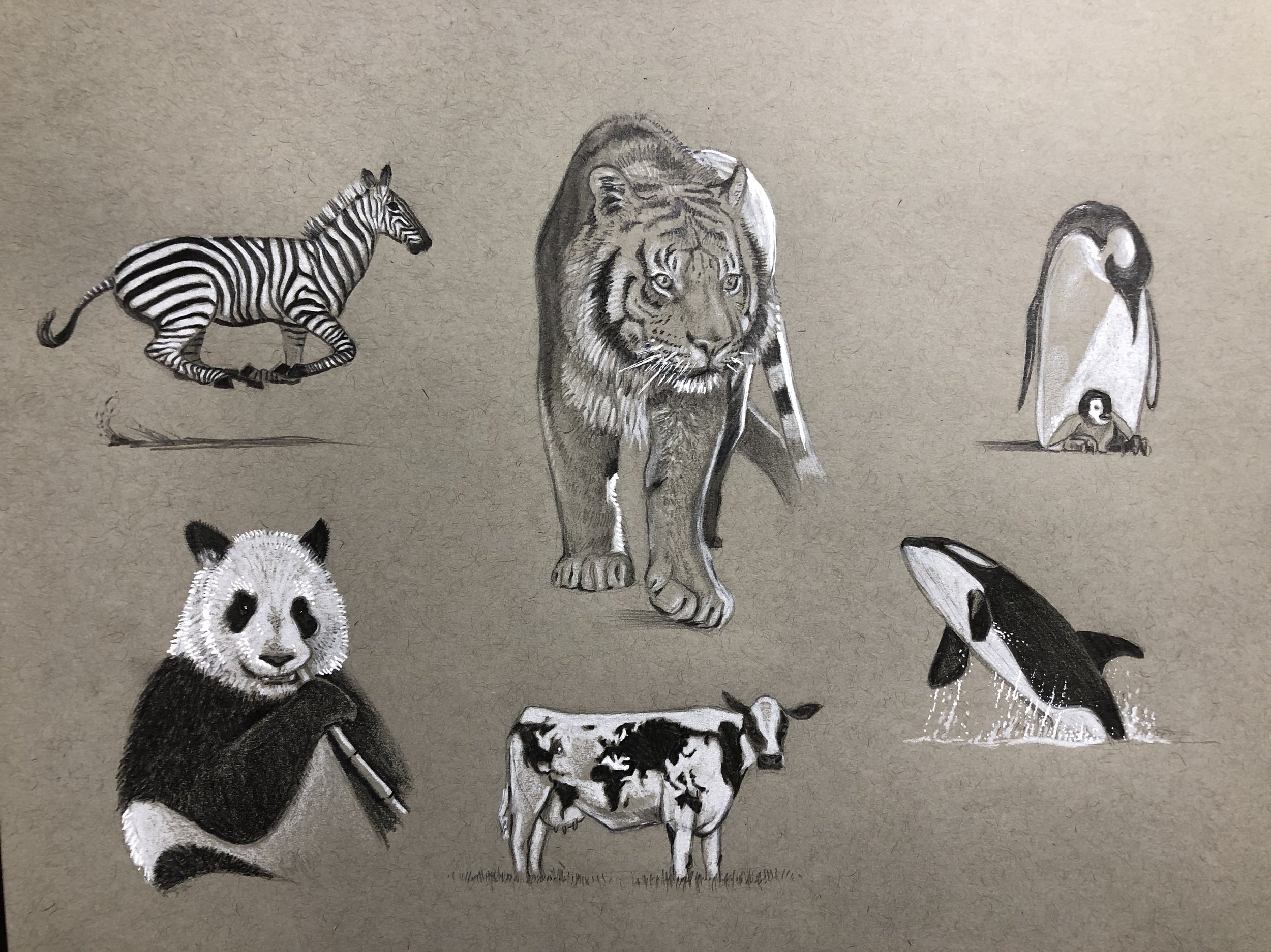
High contrast animals are so fun to draw on toned paper.

Check out @mszil_art on TikTok! He’s only 14 years old and is already a pro with high contrast artwork on toned paper.
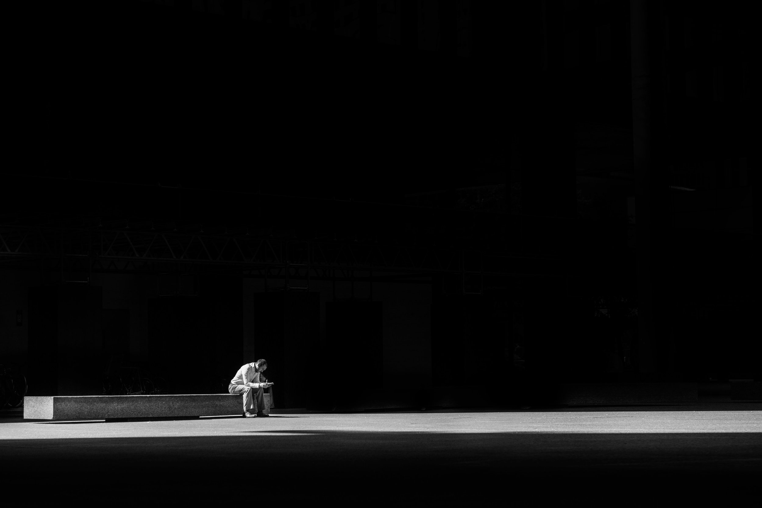
HIGH CONTRAST REFERENCE PHOTOS
I would love to check out your artwork and progress on TikTok. If you tag me with @pencilshark I can easily find your artwork. Before you go, here are some handpicked high contrast reference photos you can use for practice. Find more at Unsplash.com